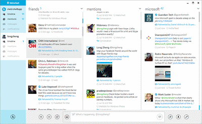
Now that Windows 8 has been released for some time, it seems apps other than Microsoft's are turning to the metro, flat Windows 8 style.
The first (and obvious) set of apps are the ones in Microsoft Office 2013
 |
| MS Outlook 2013 |
 |
| MS Lync 2013 |
 |
| MS Word 2013 |
 |
| MS Excel 2013 |
 |
| MS Powerpoint 2013 |
And we start to see some reaction from the outside community starting with Evernote. Their latest beta release (Evernote 5) uses the metro UI design.
 |
| Evernote 5 for Windows |
Lastly, although not as famous, a twitter client for Windows desktop, MetroTwit uses the same UI style.
 |
| MetroTwit, a Windows Twitter client |
The movement is still very slow, but I believe more and more apps will be forced to start using the Metro style if they want their apps to fit in the new Windows OS. Is this a good thing? I say it's a natural thing and that we'll all come to get used to it (if not like it) and eventually embrace it.
Enjoy.
